Key outcomes: $1M support cost savings and support site NPS improvement of 20 points; 20% lift in FRE completion; $4.5M savings in setup costs..
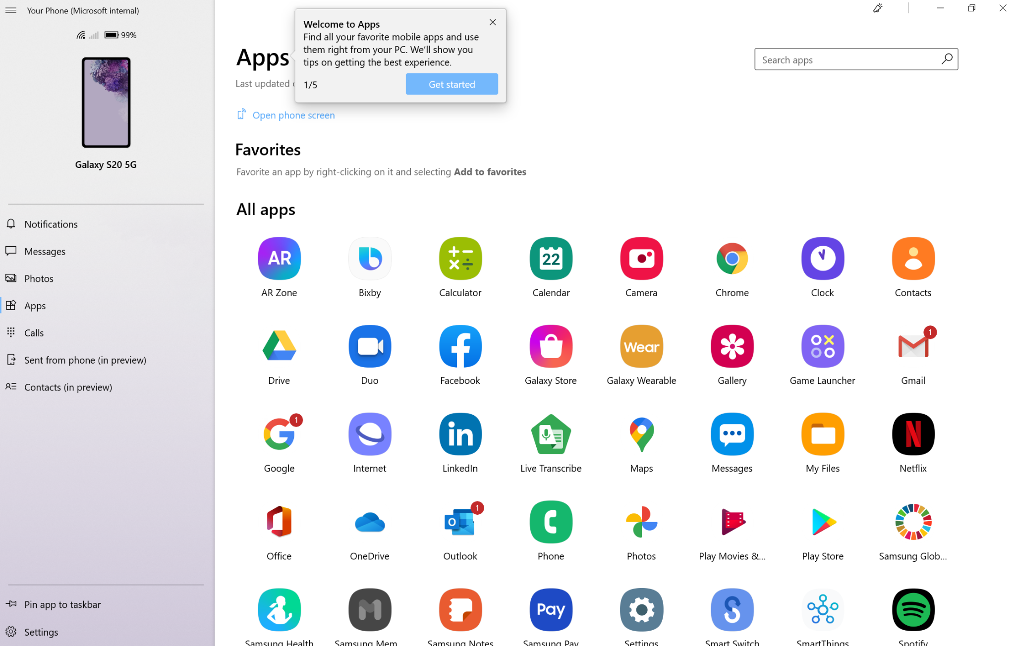
As lead writer for the Your Phone app, I owned the entire content ecosystem — UX copy, tips, What's New, support content, store release notes, and marketing. The app bridged Android/Samsung devices with Windows PCs, but a fragmented device landscape (two different companion apps, Samsung's tight confidentiality requirements, and fast feature cycles) made alignment and consistency a constant challenge.
I ran in-product content experiments monthly and partnered with UX research on user studies that directly drove millions in cost savings. Below are the projects where content design made the most measurable impact.
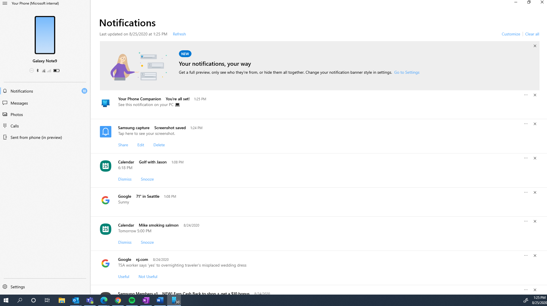
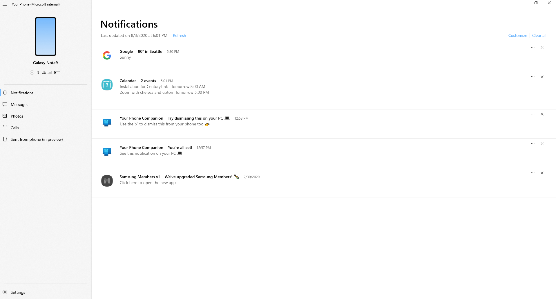
The existing support site was disorganized and chronically out of date. I rebuilt it from the ground up: created a centralized hub, restructured content by feature, and designed a templated page format with eligibility info, setup steps, and a Q&A troubleshooting section organized by the most common errors reported by our customer service partners.
In parallel, I rewrote 200+ app-wide error messages to include actionable troubleshooting guidance, and rolled out a new change request process so the site stayed current with bug fixes and feature updates.
Result: $1M+ in support cost savings and a 20-point NPS improvement in the 12 months post-launch. Clarity created savings.
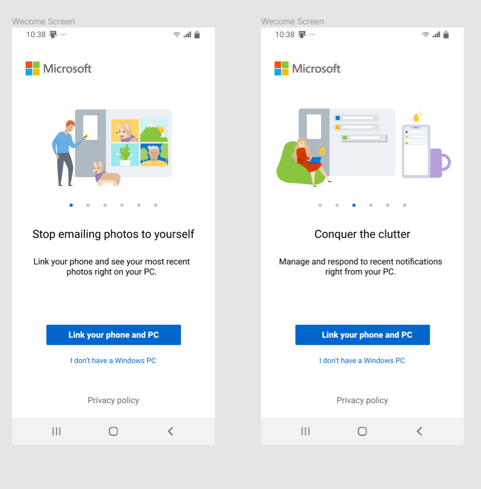
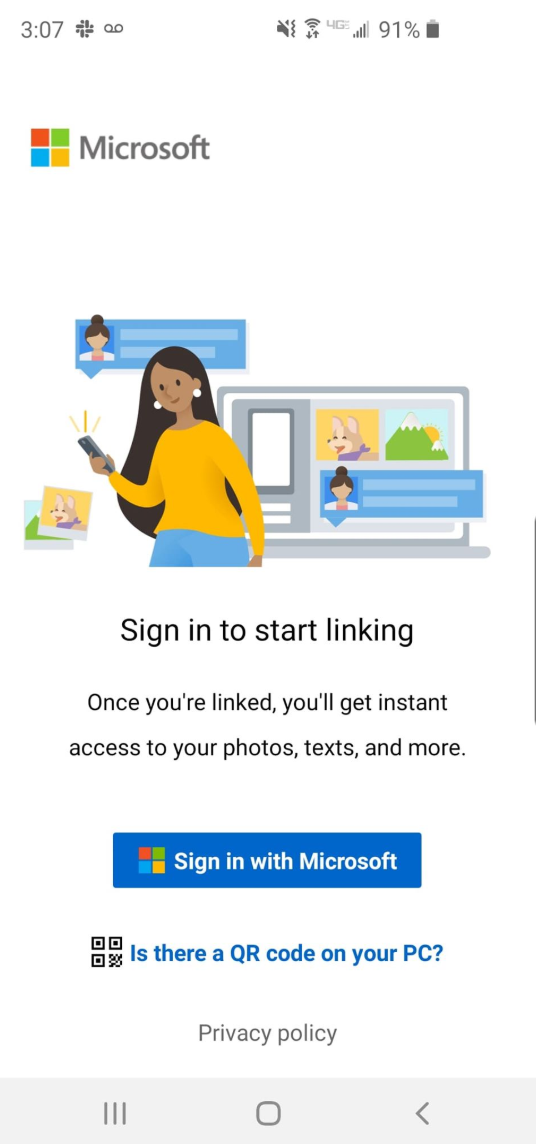
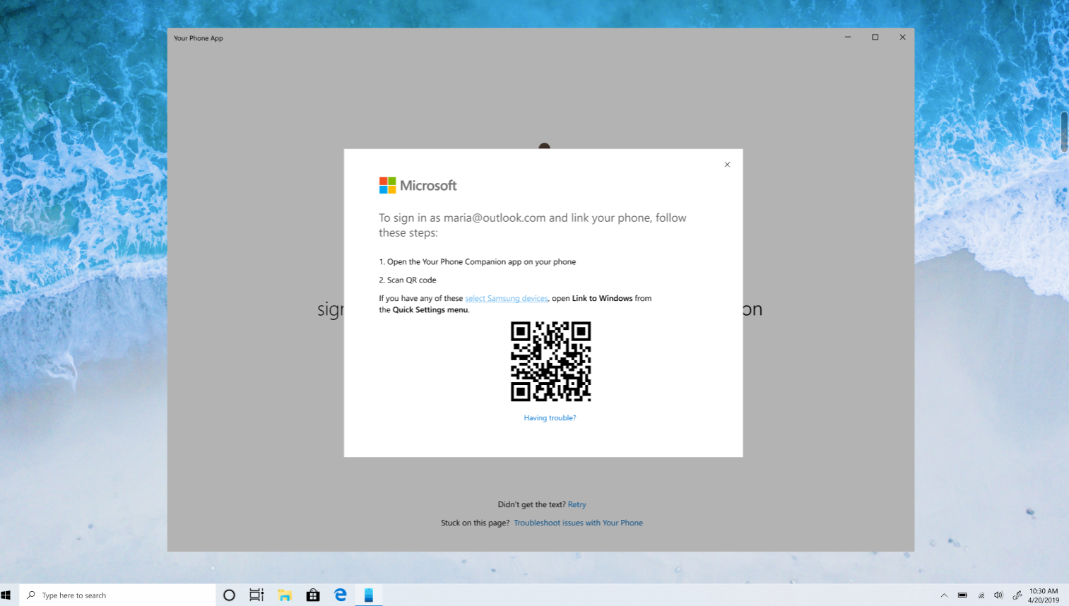
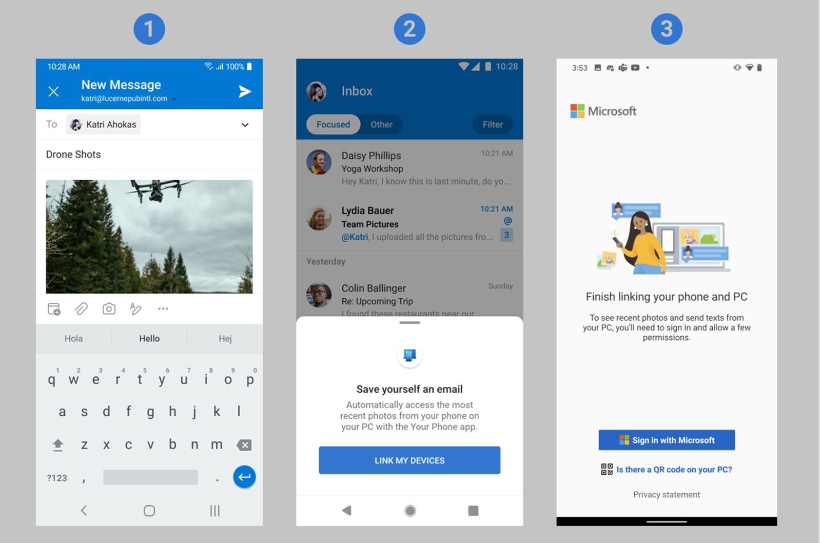
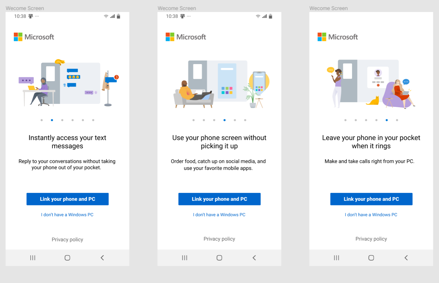
The original Link to Windows landing screen offered little value prop before asking users to sign in — a steep drop-off point.
Hypothesis: Communicating clearer value upfront would incentivize users to complete device setup.
Action: Designed and tested 5 copy variants (one per major feature), validated through usertesting.com, then ran the winner as an in-production experiment. Also added an "I don't have a Windows PC" exit link to filter ineligible users earlier in the funnel.
Result: Final winner produced a 5.92% increase in FRE completion.
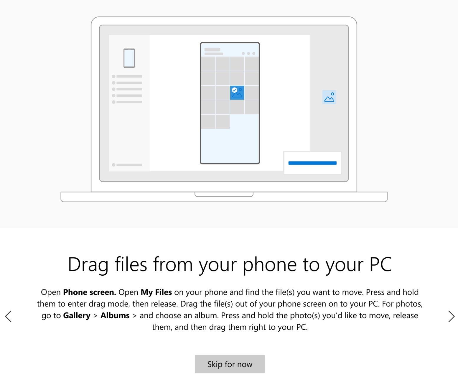
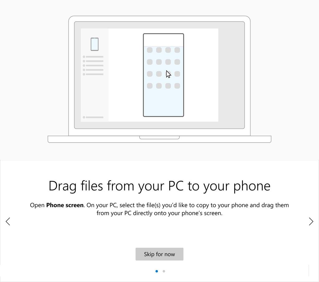
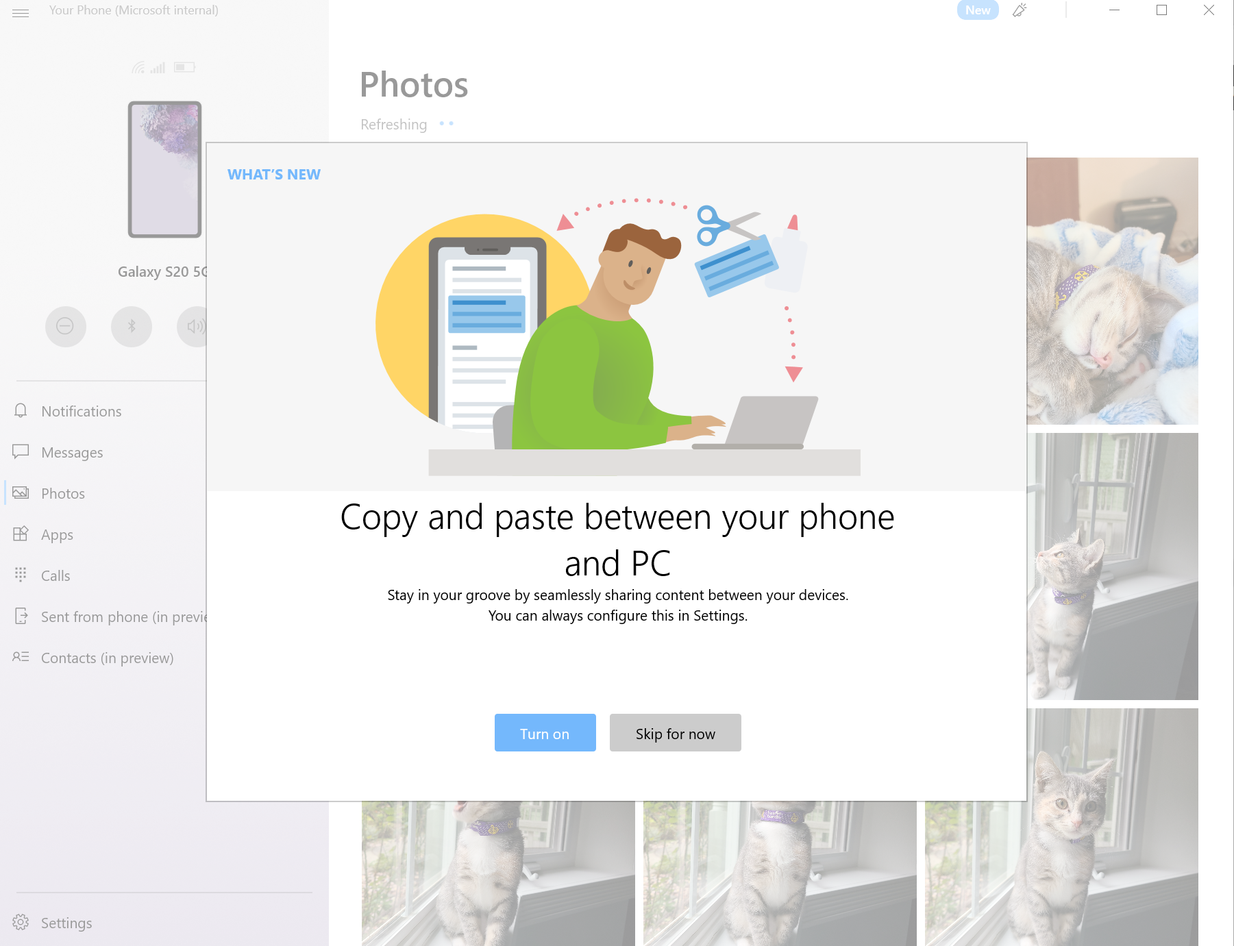
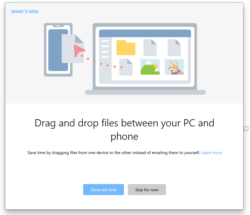
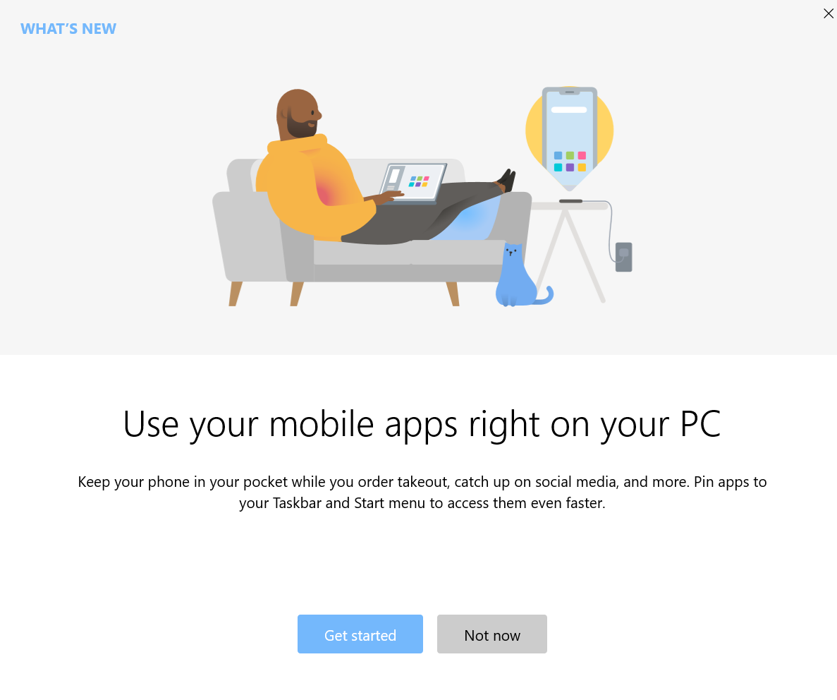
Partnered with design to add visual tutorials to the FRE, surfacing features like drag-and-drop that had no dedicated UI. Tested copy variants to optimize messaging, increasing feature discoverability and usage.

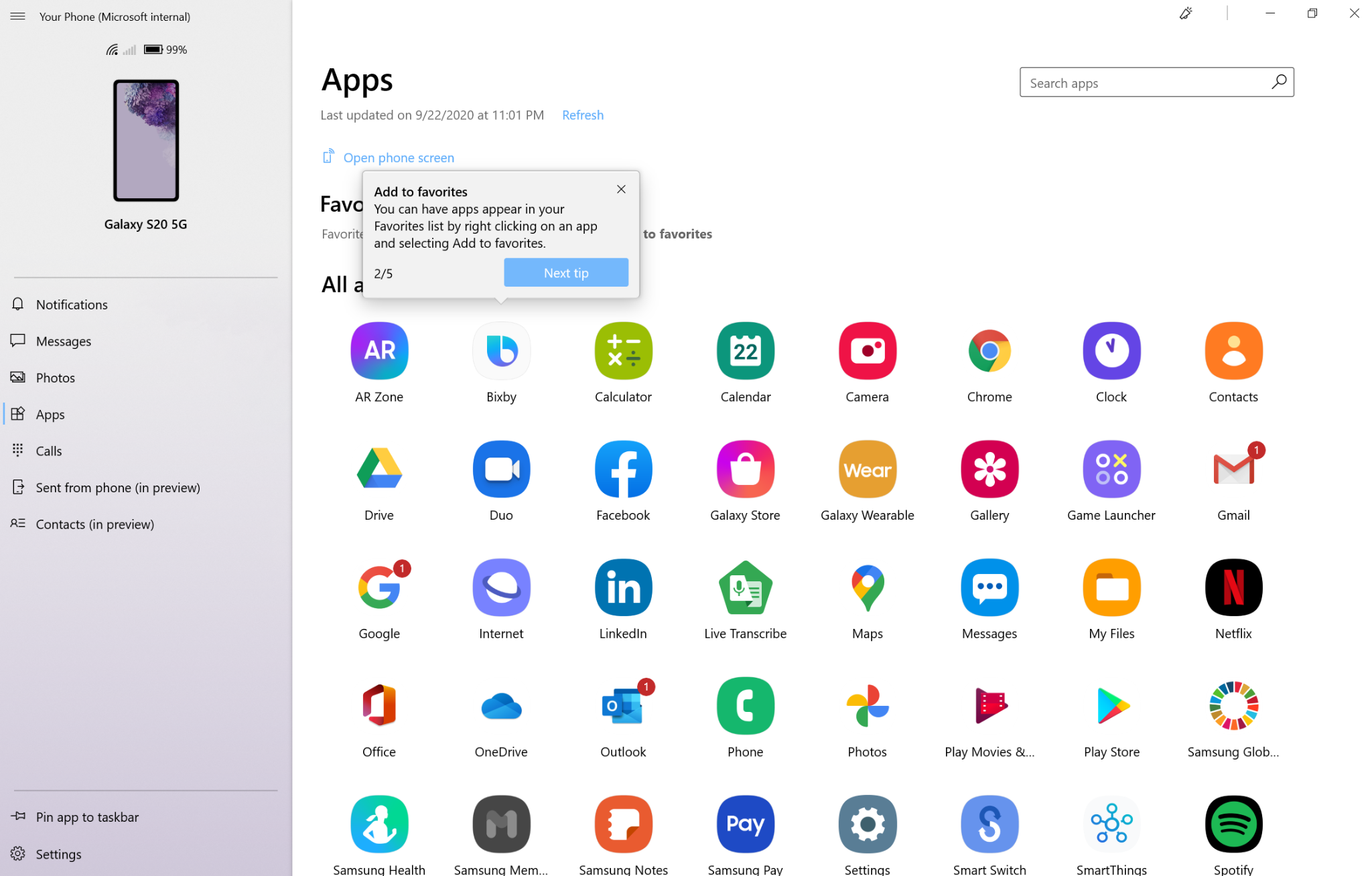
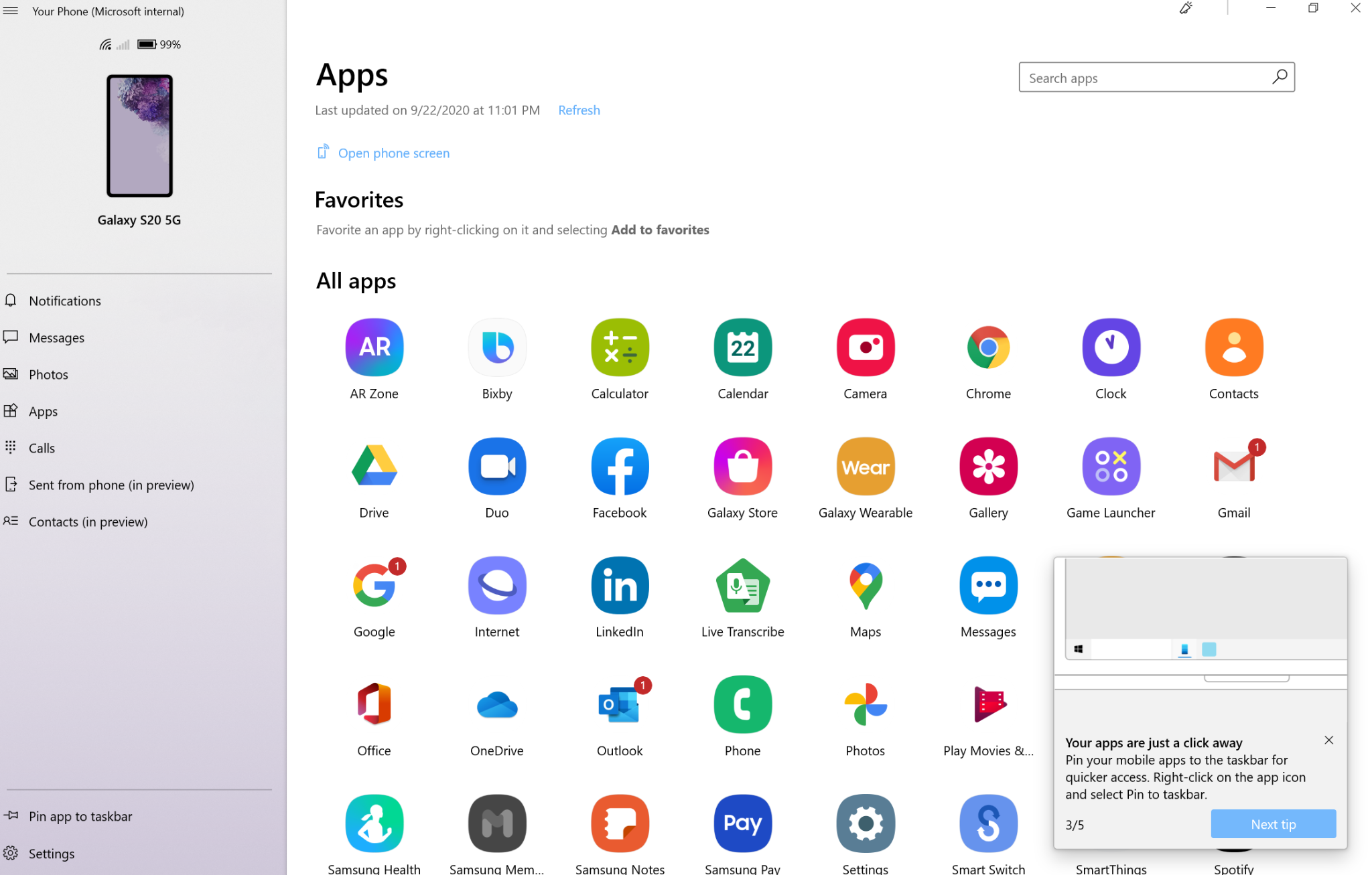
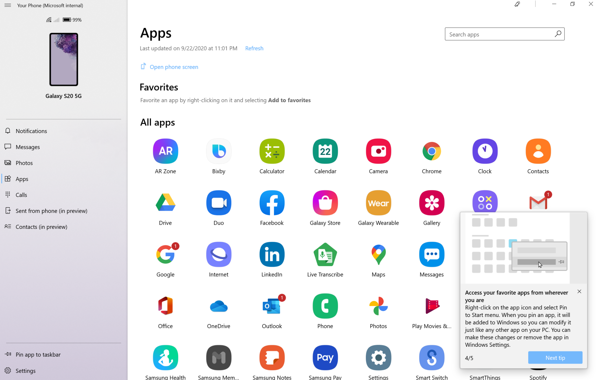
Proposed and wrote a series of 5 contextual tips that surfaced post-onboarding to drive feature discovery for new users. Tips were also featured in the Windows 10 Tips app, extending their reach beyond the product.
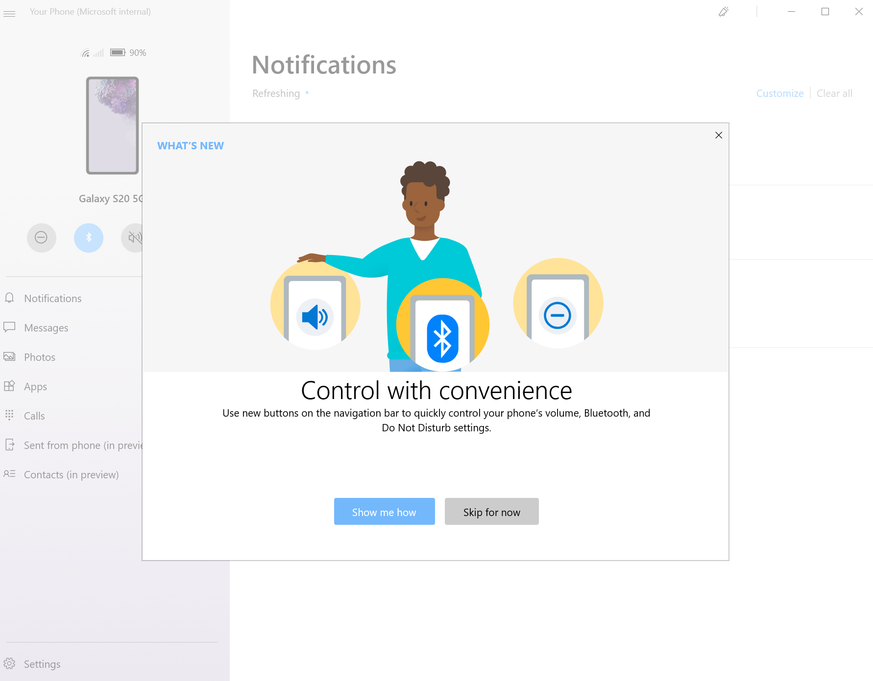
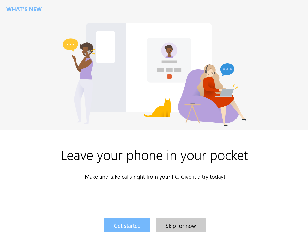
Wrote What's New tiles for every feature launch, appearing on first app open post-rollout. Regularly tested copy variants via usertesting.com to match customer language and values, and collaborated with design to identify the most effective in-app surfaces for feature messaging.